

Selecting a wedding day color palette that strikes a balance between timelessness, creativity, and authenticity can be a little tricky. The best wedding color ideas and inspiration are both unexpected and sophisticated — adding stunning pops of color can be a lovely surprise that makes your wedding decor unique, but be careful not to go overboard. You don’t want to regret your choices once color trends change over the years. If you choose hues that you truly love, you’ll be able to look back on your wedding day photos without saying to yourself, “what was I thinking?”
These are some of our favorite color ideas for a wedding day. We’ve picked shades that are fun and a little different from what we see all the time, without going stale as trends change.
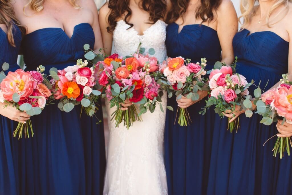
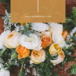
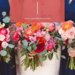
1. Dark blue + punch of pink or coral
Shades of navy have been all over the place in wedding color palettes. We see navy all the time, and it’s become a staple neutral for couples who don’t want to go too dark (with black) or too drab (with so many shades of grey). If you’re feeling adventurous, you can brighten up a basic navy by upgrading to a muted cobalt, like Elizabeth and Andrew did. And Jackie and Ian did something similar at Maravilla Gardens with bright navy menswear and colorful bouquets.
2. Dusty blue + oxblood
We’ve also seen a LOT of muted, mid-range blue tones in the last couple of years; blue is a classic shade that stands the test of time. It pairs pretty well with almost any color you can throw in, and our current favorite is a dark shade of rich red, like Vanessa Noel Events did with stunning oxblood peonies at Andria and Kevin’s Santa Cruz wedding.
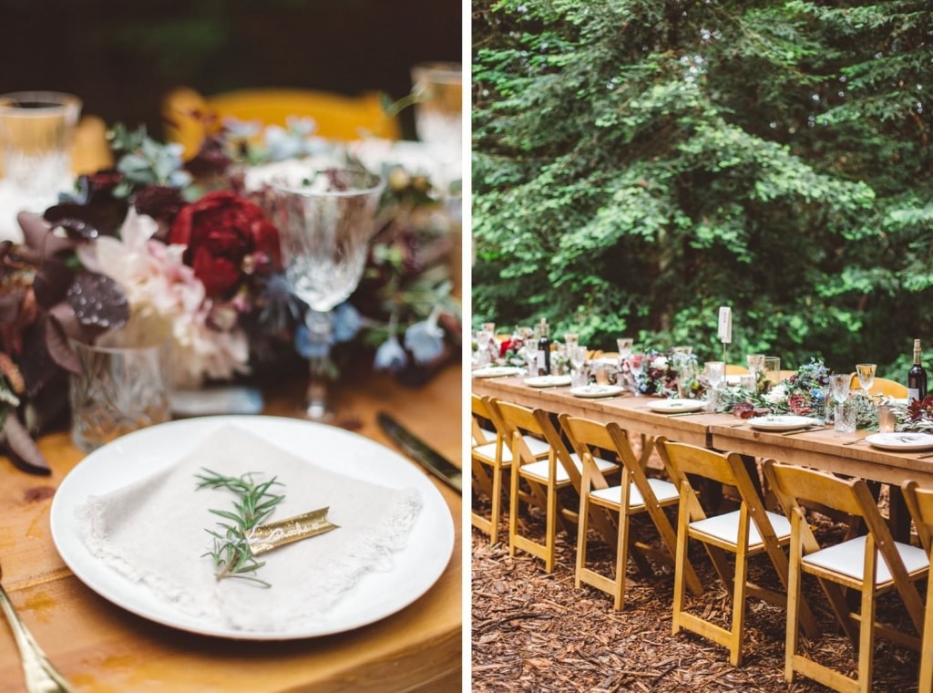
3. Earth tones
Rich gold, deep brown, earthy tan, and a pop of rust feel luxurious without going too glam (or playing it too safe with overly-muted neutrals). This combination has a little bit of a hipster vibe to it, but make it YOURS by going with decor that feels authentic to you (instead of jumping on the Moroccan rug bandwagon because it’s what’s “in” right now). Don’t get me wrong — we love Moroccan vibes and vintage rugs! But avoid trend burn-out by sticking with your own style.
4. All white
Okay, sometimes this can feel a little hum-drum, but an all-white palette is as timeless as you can get! Keep it from feeling boring by putting lots of textured greenery into floral arrangements, and consider a little bit of color (Wedding Kate chose a beautiful shade of crystal blue for this gorgeous spring wedding at the Bacara). When it comes to white, texture is your friend.
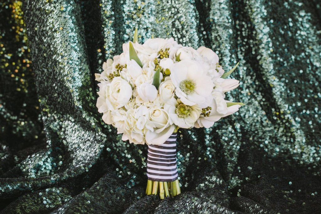
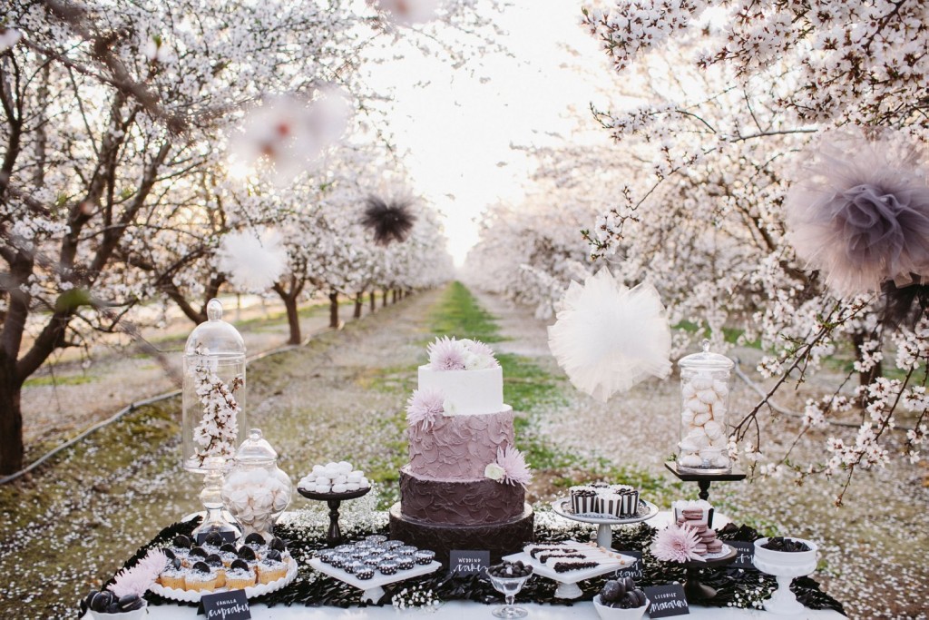
5. Black + white + emerald
I’m kind of a sucker for emerald and jade, so this preference might be specific to me. But I will never walk into a wedding with black and white stripes with a punch of rich green with any complaint. This can also be accomplished with black and white with a pop of almost any bright color (don’t overdo it with a too-bright shade of fuchsia or magenta, and use caution with orange so it doesn’t look like Halloween).
6. Dusty grey-lavender
Anyone who has heard me speak on wedding colors for more than two minutes will know how I feel about purple gone wrong. Purple, lavender, periwinkle, eggplant — a wedding with these shades at its core can be so challenging to do with sophistication. It’s really easy for bright purple to feel too cutesy or juvenile. The key is to go as subtle as possible. Pops of lavender from this shoot with Vanessa Noel Events offered a muted shade of purple with lots of grey tone, so it didn’t overwhelm.
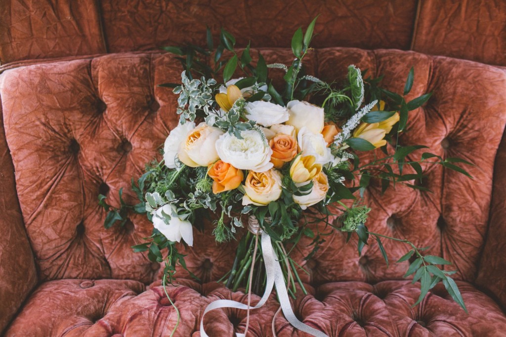
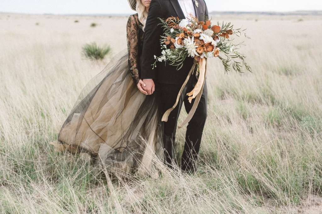
7. Orange + peach + greenery
As with dusty grey-lavender, approach this color scheme with caution; we’ve seen orange done really well, but we’ve also seen it go terribly wrong. So go easy on the super-bright shades, and balance it with plenty of muted terra-cotta tones and greenery in floral arrangements. Solid orange bouquets without texture and dimension will feel more Crayola than chic.
Regardless of the colors you choose, there are a few key points to consider to keep the color itself from overpowering the vibe of your day:
- Dimension + balance // most bright colors work best when used sparingly, so just because you’ve chosen a bold hue as your focus doesn’t mean every corner of your wedding should be drenched in that color. Balance that strong saturation of color with whites and greens in floral arrangements, the use of additional darker or lighter shades in the same color family (i.e. using rust, terra-cotta, and/or peach to offset a bold orange), and keeping some elements neutral (don’t use an exact color match for all of your linens, napkins, flowers, bridesmaids dresses… you get the idea).
- Texture // if you’re really obsessed with the color you’ve chosen, break up the monotony by diversifying textures. You can do this with a variety of flower choices in bouquets and arrangements (instead of an all-peony bouquet, for example), mixing and matching linens and textiles, and letting bridesmaids choose different styles of dresses in the same color (or comparable shades in the same color family). This will keep your color scheme from feeling too flat.
- Mood // use color to help curate the mood of your event, rather than focusing solely on making everything matchy-matchy in a single shade of any given color.


