Want to know the three biggest mistakes happening in wedding photographers’ galleries? (Psst. I made the same bungles myself. There is always room to learn and grow!).
Mistake #1: Flat lay props that don’t make sense.
When it comes to designing a thoughtful flat lay, whether with the couple’s personal details or wedding stationery, make sure you’re using props that are intentional. A common prop that doesn’t make sense? Those super cute little sewing scissors, styled with a bride’s or groom’s personal accessories. The scissors are pretty and fill space, but what relation do they have to shoes and jewelry?
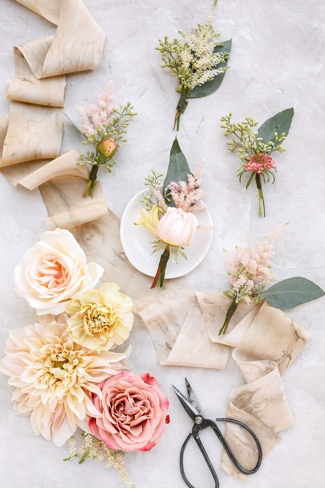
Conversely, scissors DO make sense with flat lays that focus on flowers and ribbon, because you’d actually USE scissors in relation to those subjects (especially the garden scissors in the image above, which a florist might use to trim the stems for the boutonnieres!).
Mistake #2: Salt and pepper shakers on reception tables.
Salt and pepper shakers are usually not contributing to the aesthetic of a wedding tablescape; they are service items and therefore shouldn’t be included in your images showcasing the decor of a reception table. Typically, these items are standard issue from either the rental company or the caterer and tend to distract from intentional design choices and lower the aesthetic appeal of the overall scene.
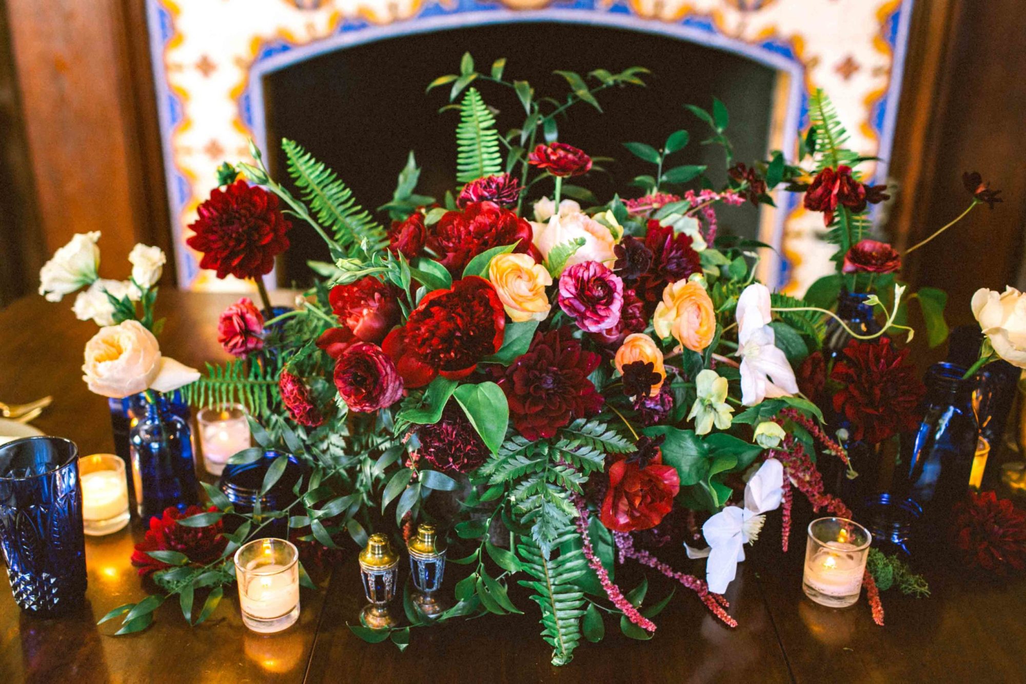
In some limited instances, the salt and pepper shakers (and other service items) might indeed be a design choice, in which case you can (and should!) leave them on the table for detail photos, like in this editorial centerpiece display with vintage cobalt salt and pepper shakers.
Mistake #3: Reception spaces without the chairs.
If the chairs from ceremony are being repurposed at the reception, it’s important to wait for the chairs to be placed before getting a full table or wide room shot. Dinner tables without chairs look unfinished (and so will your photo).
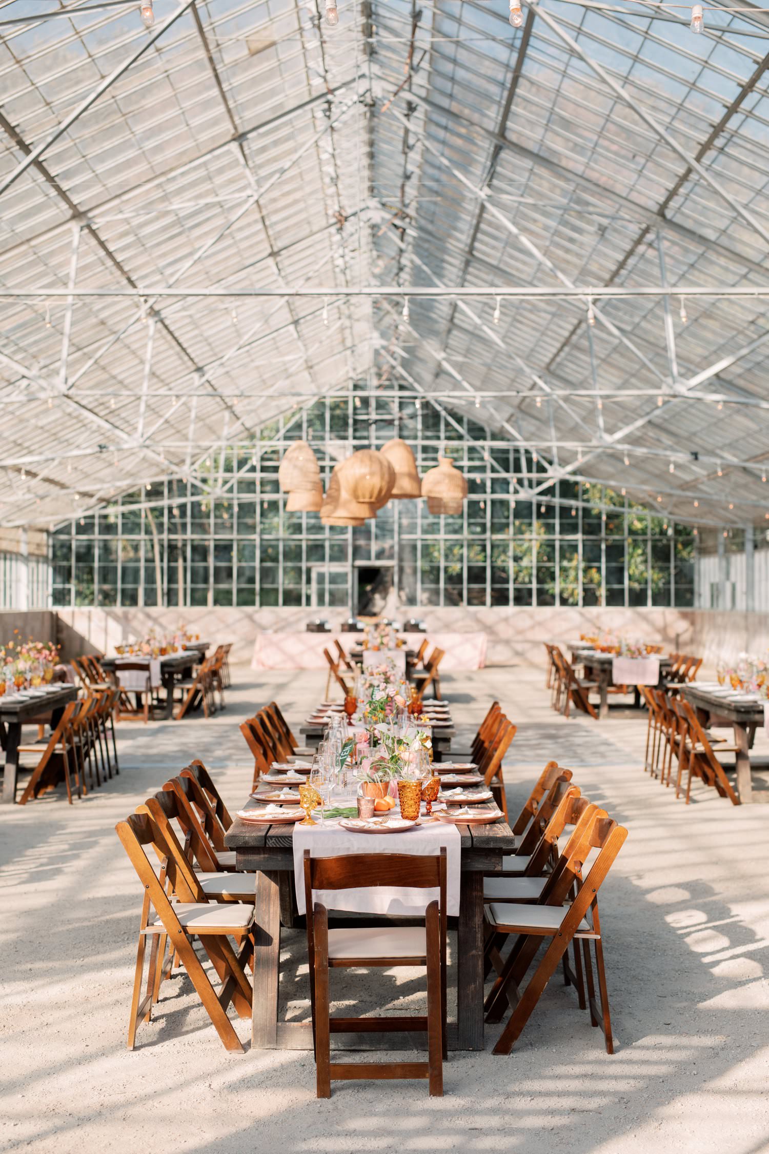
Go the extra mile and straighten chairs, too! Tidy chairs elevate your reception details.
